More Maps: Did open defecation really decline in India between 2001 and 2011?
— Blog Post — 3 min read
Its still chart month on rice blog, and here are some new maps.
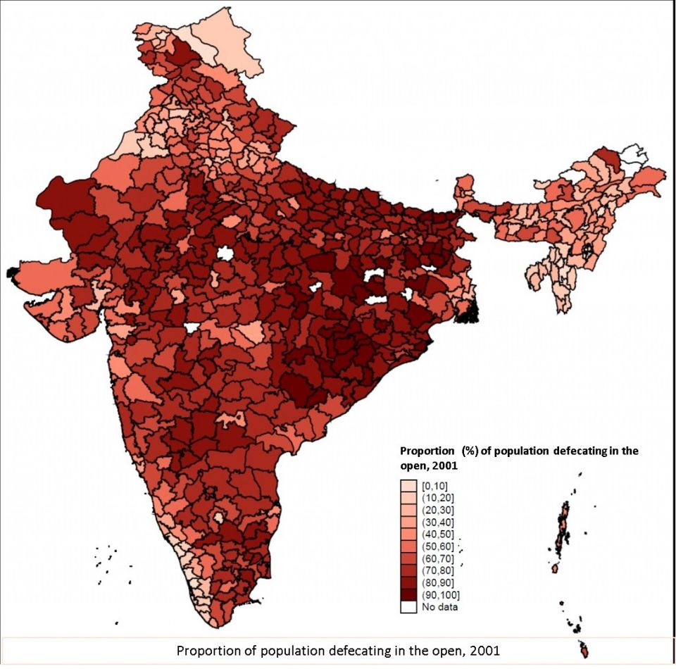
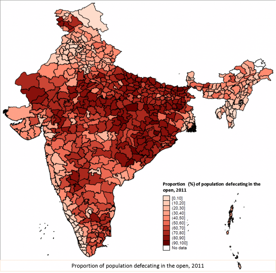
When the results of the houselisting operations of the 2011 Indian census came out, most newspapers published articles comparing mobile and toilet ownership (here is a sample). Even when the situation was bad, commentators were of the opinion that at least there has been some progress on sanitation coverage, even if slow. Indeed, the proportion of population with a toilet increased in this period, as the district-wise maps below, created using the same method we have used in the past to create world open defecation maps, show.
You can see that the map below is less red/brown than the map above (the white blank spaces are due to unavailability of data). Of course, this map has been done better by others, such as by the very cool blog datastories.in, which did these maps at the block level in two different ways.
But, as we explained in the our previous map post,
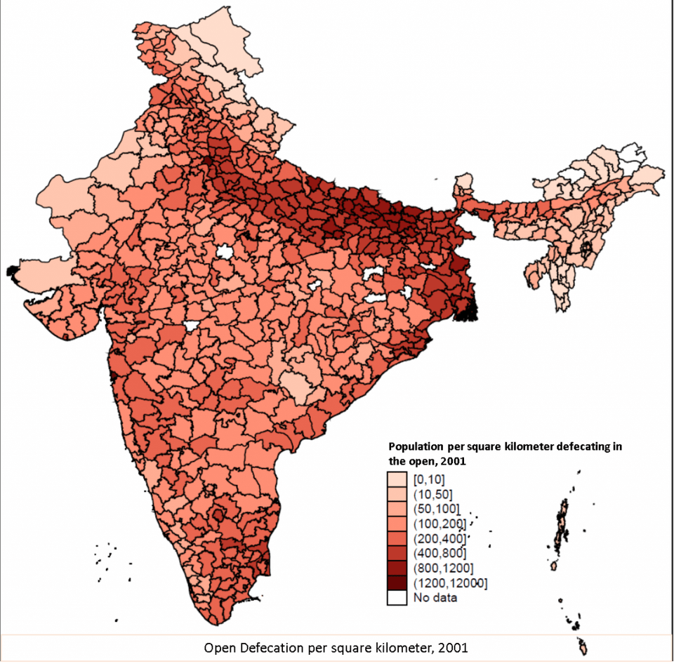
Rice’s research shows that “Open defecation is particularly harmful to children’s health where population density is high”. Indeed, even intuitive reasoning would lead to the conclusion that for a kid, what matters is not the proportion of people defecating in the open in a country, but the number of people defecating in the open around his or her surroundings. A way to measure that is to measure number of people defecating in the open per square kilometer.
So here is a third way of doing this map, apart from the two presented by datastories: at the district level, but showing the number of people defecating in the open per square kilometer in that district. The two maps below, for 2001 and 2011, do exactly that.
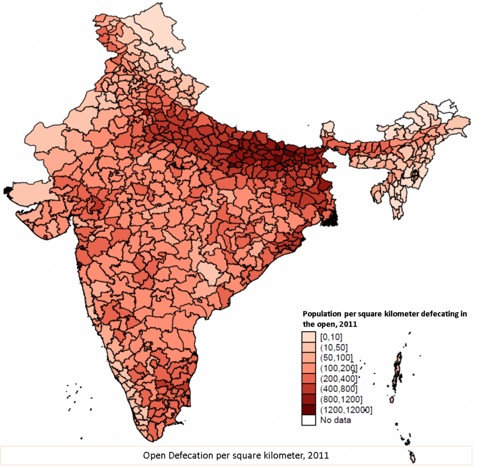
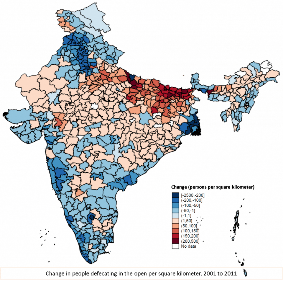
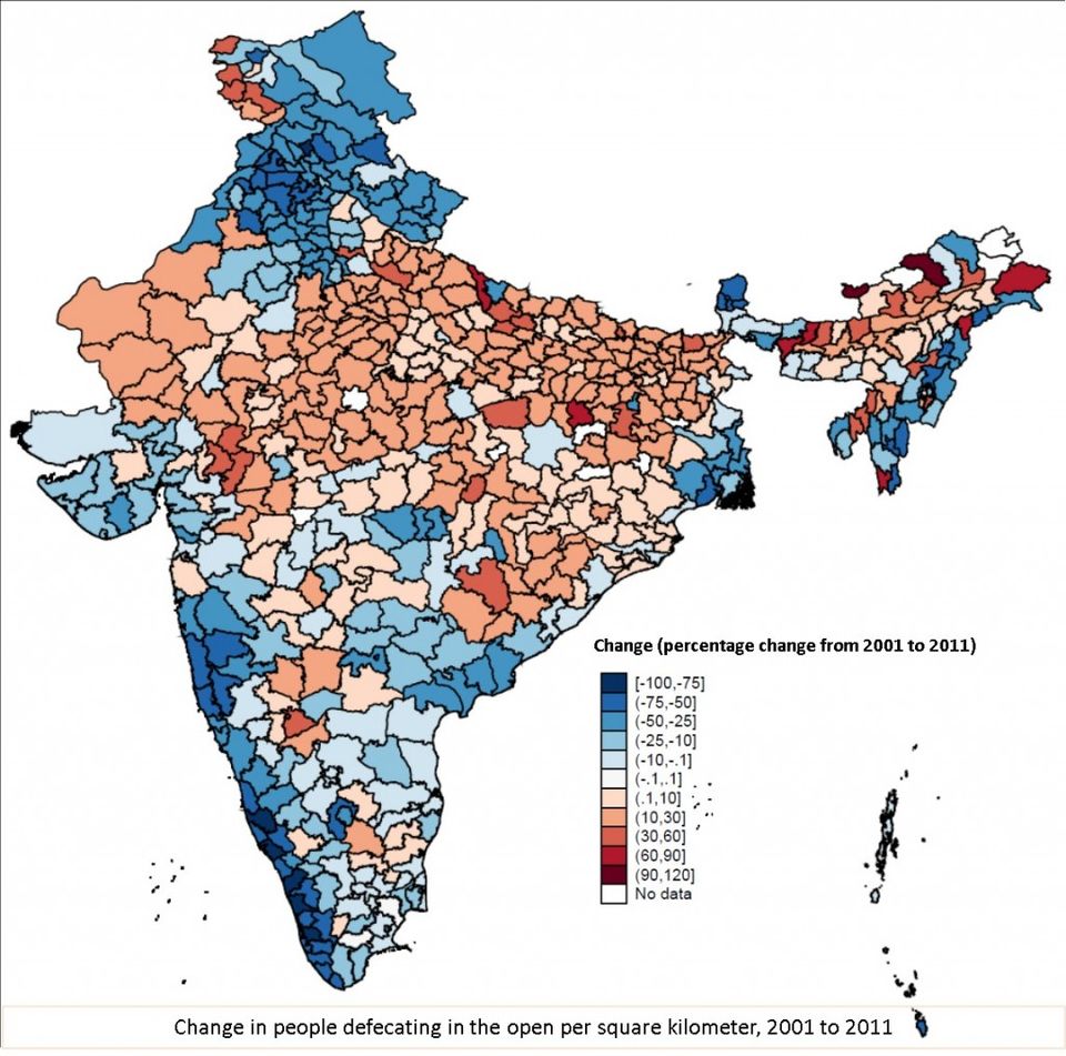
The differences between these two maps seem a bit more difficult to see. While there seem to be districts of India where open defecation per square kilometer decreased, such as cities of Delhi or the state of Kerala, there seems to be many places, particularly in the Hindi-Heartland, where open defecation per square kilometer has actually increased. These two charts paint a different story from the story of overall improvement in every district in open defecation as shown by maps that show the proportion of families who own a toilet. To make it easier for you, we post a map that shows the change in number of people defecating in the open per square kilometer in the following map.
The areas in shades of red are where open defecation per square kilometer has increased, and the areas in the shades of blue are where open defecation per square kilometer has declined. The darker the shade, the more the decline or the increase.
You can see that things got a lot worse in many districts, while they improved in some others. In particular, Uttar Pradesh, Bihar, Jharkhand, Madhya Pradesh, Orissa and Rajasthan are the places where things got worse, while they seem to have improved in coastal areas of India (particularly Kerala) and up north in Himchal Pradesh, Uttaranchal and Punjab. However, it is important to realise that an awful lot of people live in these states where open defecation per square kilometer got worse, which means that the disease environment and child health got worse, too, despite other improvements, such as in government programmes, literacy, or income.
In a new working paper, Dean argues,
most people in India live in a district where their exposure to density of open defecation increased from the 2001 census to the 2011 census. This is especially true outside of a few highly densely populated and relatively highly developed metropolises. If exposure to open defecation density is indeed a relevant risk factor for early life health and human capital accumulation – as an active and growing literature indicates – then there is little evidence that sanitation in India has been improving; indeed the average sanitation exposure in India arguably worsened from 2001 to 2011.
The same map can be done as district-wise percentage change in open defecation per square kilometer, and it does end up looking more dramatic if we do that. Here we can see that its not just Bihar or Uttar Pradesh that performed worse on our indicator for disease environment - open defecation per square kilometer - other rural areas in north India, such as Rajasthan and Madhya Pradesh are also pretty bad, they are just less densely populated than Bihar.
With that depressing map, we leave you, dear reader of rice. Do keep in mind the health emergency that lots of Indian districts face when it comes to open defecation, and if you can contribute to the cause of changing sanitation policy in India to encourage behavior change, do try to do that. Also, when someone, particularly in the government says to you that look, open defecation is on the decline in India and we are working hard, tell them that no, open defecation per square kilometer is what matters, and its increasing in India. Thank you.
