How small is too small? (Part 1 of 3)
— Blog Post — 3 min read
Regular readers of our blog will know that we talk a lot about heights and weights. This is because in a resource scarce setting, body size is a useful way of telling how well off people are. Especially in a poor population like India, height is a good marker of long term health, cognitive ability and longevity. Among children especially (but adults too), being underweight is a clear sign of acute lack of food and of disease. But how short is too short? How thin is too thin? And how many people in India are too short and too thin?
Most of the data that we have about body size in India comes from children. That makes sense because children’s body size is more malleable than that of adults. By looking at children, we can see more quickly how changes in a population’s circumstances are influencing body size.
Over the next couple of days, I’d like to get into how it is that we know that Indian children are "too small" and to paint a picture of just how short and thin children in India are.
According to UNICEF, "In India, around 46 per cent of all children below the age of three are too small for their age, 47 per cent are underweight and at least 16 per cent are wasted." All three of these statistics are based on a comparison of the heights and weights of children in India to those in a healthy reference population. While I'm not entirely sure which reference population UNICEF used to come up with these figures, for the purposes of illustration, I’m going to tell you about my favorite reference population.
From 1997 – 2003, the World Health Organization (WHO) ran the Multicentre Growth Reference Study in order to provide researchers with an appropriate reference population with which to study population health around the world. The WHO collected information on how children from six countries (Brazil, Ghana, India, Norway, Oman and the USA) grew, which means that they repeatedly measured children from birth to age five.
While the children were from different countries and cultural backgrounds, what they had in common was that they were fed and cared for impeccably – the WHO only chose families who would comply with their guidelines for raising children, including exclusive breastfeeding in the first months, healthy supplementary food thereafter, full vaccination and treatment of children’s illnesses. The result of the WHO's efforts was a set of growth reference charts that showed how tall and heavy the well-cared for children are at different ages.
We can use these references to see how the growth of children in other populations compares to the growth of those who were raised under healthy conditions. To do that, the WHO established cutoffs: the WHO says that if a given child is smaller than 97.5 percent of children in reference standard, than he or she is probably malnourished. In India, 46 percent of children fit this description. While being shorter than 97.5 percent of children in the reference distribution does not necessarily make an individual child unhealthy (height depends on both genetics and environment), this is an alarmingly large fraction of the Indian population. It suggests that a large fraction of children are not growing to their full potential.
In addition to seeing whether someone is below the cutoff, we can see where she falls in comparison to the reference population. A z-score tells us where an individual falls in relation to the reference population. A child with a height z-score of zero has the average height of children in the reference population—she is shorter than about half of the children in the reference population. A child with a height z-score of -1 is shorter than 84% of the children in the reference population.
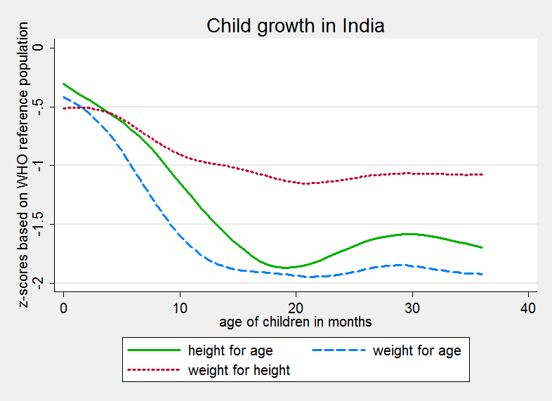
Armed with this knowledge of growth references and z-scores, let’s look at the body sizes of children in India. The graph below uses data from the National Family Health Survey (NFHS), a representative survey of India conducted in 2005-6. It plots the age of children in months on the x-axis against the average z-score of children that age. As a reminder, the z-score gives us an idea of much shorter the mean child in India is than children in the reference population.
 The graph shows that not only are children in India born shorter and lighter than children in the reference population when they are born, they also grow more slowly than children in the reference population. This slow growth is illustrated by the downward shape of each of the three lines. Basically, the falling lines indicate that as they get older, children in India get shorter and shorter compared to the reference population.
We also see these lines leveling off around two years of age. This means that while Indian children over two are shorter than children in the reference population. If we plot the graph further out (looking at older children as well) we find that the line is approximately straight, meaning that Indian children are growing at about the same rate as the reference population. Save for massive interventions to improve their nutrition and treat their diseases, they are probably not going to "catch up" to the reference population.
But of course, the graph above only shows what is going on for the average Indian child. Tomorrow, I’ll post a box plot with the same data—to help show how body sizes at different ages vary.