A new paper and a new graph
— Blog Post — 2 min read
The rice team is busy preparing for the coming months of field research: surveyor training starts this weekend, and Aashish, Diane, and Sangita are talking through last weekend’s pilot qualitative interviews as I write. Yesterday, I presented work in progress with Josephine on the disease environment and calorie consumption in India at the World Bank in Delhi. But I wanted to take a minute to share two bits of research news.
First, my paper with Sneha Lamba about caste and the clean village prize has been published this week by the Journal of Development Studies. You can read the paper here: Caste, ‘Cleanliness’ and Cash: Effects of Caste-Based Political Reservations in Rajasthan on a Sanitation Prize (apologies that they may try to charge you for it -- if so, just read the identical working paper version)
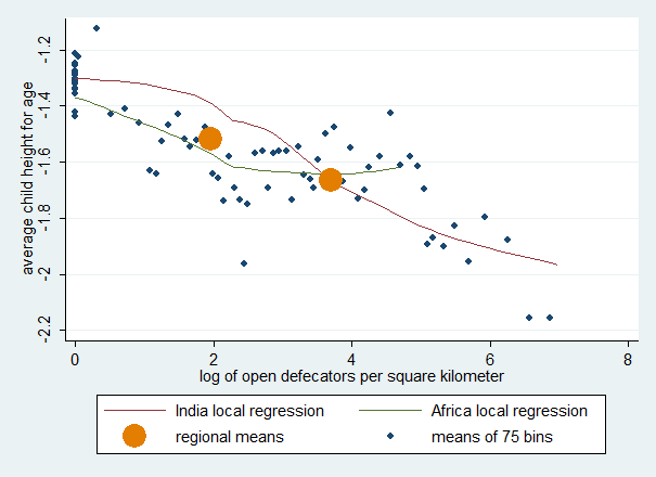
Second, I’d like to share a new graph that makes a point we’ve been making in a new and, to me, visually striking way. We have often written about sanitation and population density combining to explain the puzzling “Asian Enigma” that children in India are shorter, on average, than children in sub-Saharan Africa, even though they are also poorer, on average. It turns out that the density of exposure to open defecation can completely account for this gap, in the sense that at the same level of exposure to open defecators per square kilometer, children in India are no shorter, and perhaps taller.
This picture presents that conclusion and the data behind it. The data are from DHS surveys in India and sub-Saharan Africa, the exact same data and set of 28 surveys used in an important recent paper by Seema Jayachandran and Rohini Pande (one must choose a sample somehow, and it is convenient to follow other scholars' lead, but it also works with other samples of DHS surveys). The big circles are the overall means for India and the pooled sub-Saharan African data. The small circles are averages from 75 equally sized divisions of the sample along the horizontal axis, by density of open defecation. The two lines are local non-parametric regressions for the Indian and African samples. You can see that the difference in average height between the two big dots can be accounted for by the gradients within the two samples.
Of course, this isn’t the whole story. For example, nothing in this picture invokes the econometrics of cause and effect. Moreover, this picture doesn’t explore the interesting fact that, because open defecation interacts with population density (other people’s germs are worse for your health if you are more likely to come into contact with them), and because population density is much lower in sub-Saharan Africa than in India, the sanitation-health gradient is much steeper in India. For all of that you need the full research paper. But I do think this figure helps persuade me that the regression and decomposition results are not merely a misleading statistical fluke.
